When it comes to decorating your bedroom, it’s all about crafting a space that resonates with your personal style and provides a haven of comfort. While the color palette is a powerful tool for setting the mood, not all hues are equally suited to the serene ambiance you seek. Renowned color consultant Amy Woolf has shed light on the colors that might not be the best choices for your bedroom sanctuary.
- Black: Dimming the Light of Serenity
While black might exude sophistication, it’s not the most ideal color for bedroom walls. It tends to absorb light, potentially dimming the ambiance and “sucking the life out of any space,” according to Woolf. If you’re drawn to darkness, consider using black in accents and decor rather than as the primary color.
- Gray: Battling the Battle-Ship Vibe
The trend of gray aesthetics has sailed far and wide, but according to Woolf, it might give off a “battleship vibe” that doesn’t necessarily inspire relaxation. Instead, opt for shades that carry a hint of gray, like soft gray-toned greens or blues. These colors can infuse your space with a calming touch.
- Browns and Beiges: Bypassing Blandness
While neutrals have their charm, some shades like browns and beiges might not evoke the sense of joy you’re seeking at the beginning and end of your day. These tones can often be perceived as boring. If you’re drawn to earthy hues, consider incorporating them in small doses while mixing in more vibrant colors.
- Deep and Bright Orange: Taming the Energy Surge
Vibrant shades of orange can be invigorating, but they might prove too stimulating for a restful bedroom environment. Instead, opt for a pale orange reminiscent of the soft apricot glow of sunrise – a hue that can infuse your space with warmth without overwhelming.

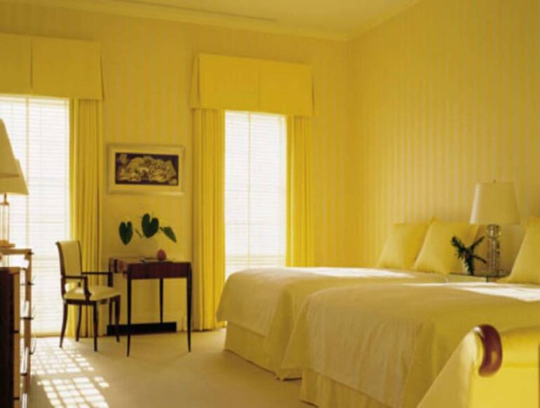
- Bright Yellow: Dialing Down the Buzz
While yellow is associated with energy and positivity, bright yellows might not be the best fit for a relaxing bedroom. To achieve a balanced look, choose a pastel shade of yellow that exudes a soothing energy, evoking calmness rather than buzzing excitement.
- Overwhelming Purple: Striking the Right Balance
Purple, with its regal connotations, can easily overwhelm a space if not chosen carefully. Some shades might come across as overly bright or cloyingly sweet. To strike the right balance, opt for subdued shades of purple that infuse elegance without overpowering.